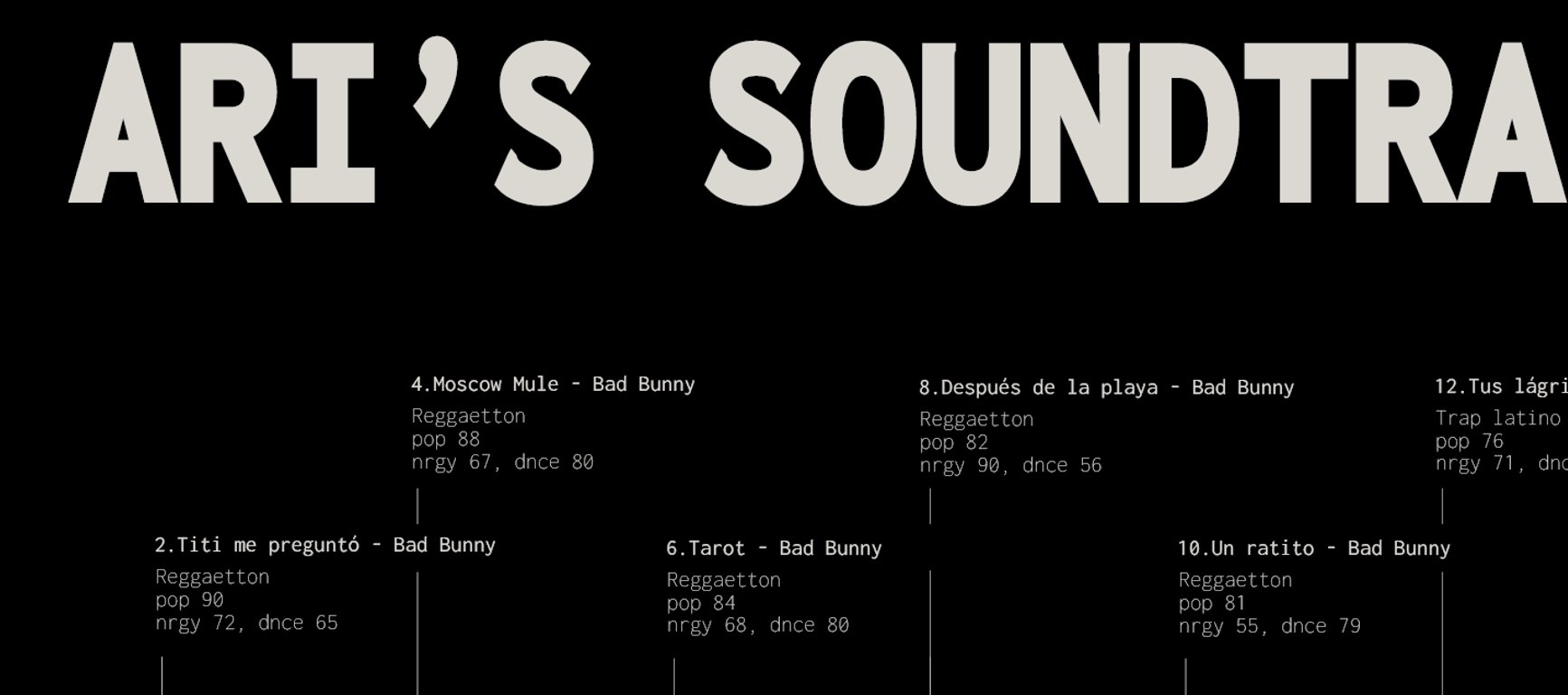
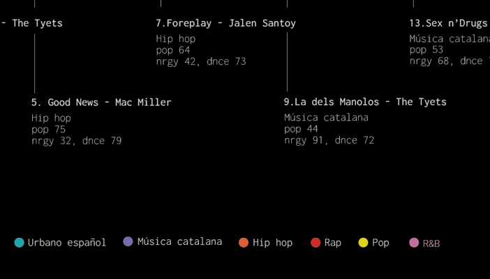
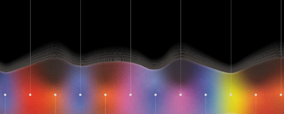
Visual Soundtrack*
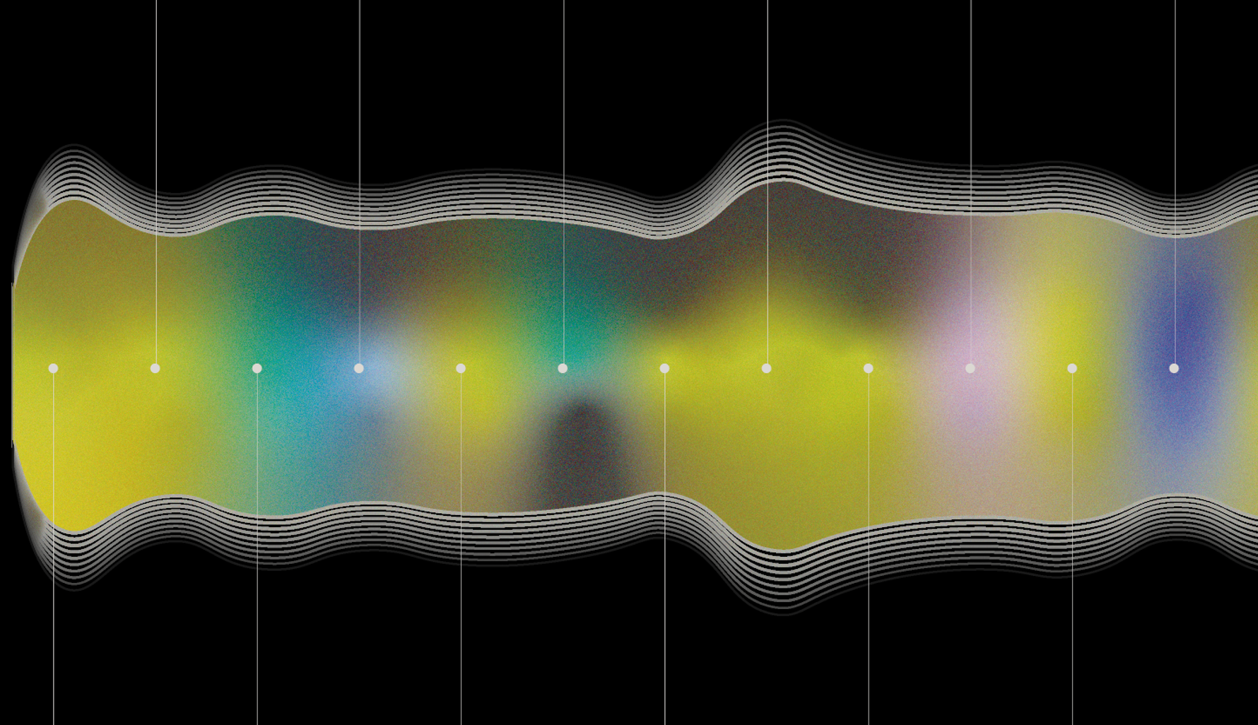
This project features an infographic that visualizes an audio wave formed by my 15 most-played songs on Spotify. The infographic reveals individual music tastes and the diversity of styles. By analyzing data such as music genre, popularity, energy, and danceability, a visual representation in the form of a wave is created. Each song is represented by a section of the wave, with its size reflecting its popularity and its color indicating the music genre. The darkness of the color represents the song's energy: the darker the color, the lower the energy. Similarly, the level of danceability is shown in the lower section, with variations in the color’s darkness. The wave is enhanced with a gradient and depth effect, creating an aesthetically pleasing and cohesive visualization. Accompanying the wave is detailed information about each song, allowing for a clear interpretation of the represented data.
Deliverables:
Data Visualization, Poster
Year:
2023
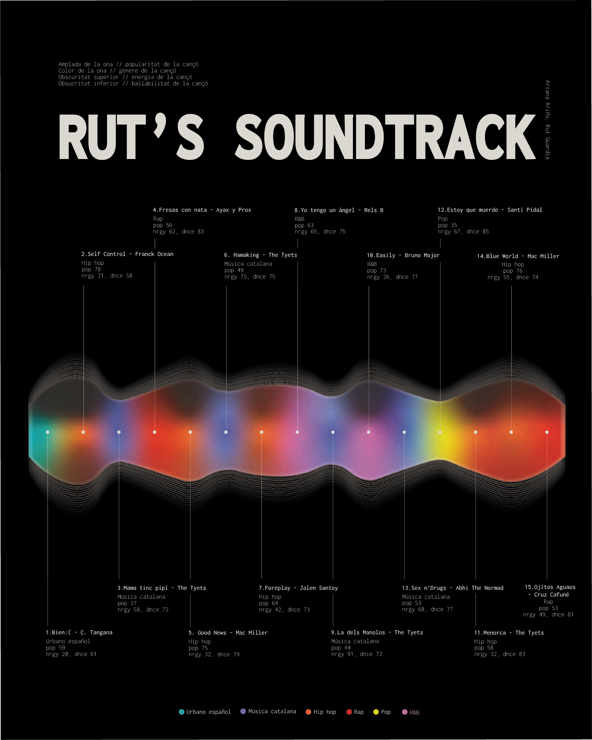
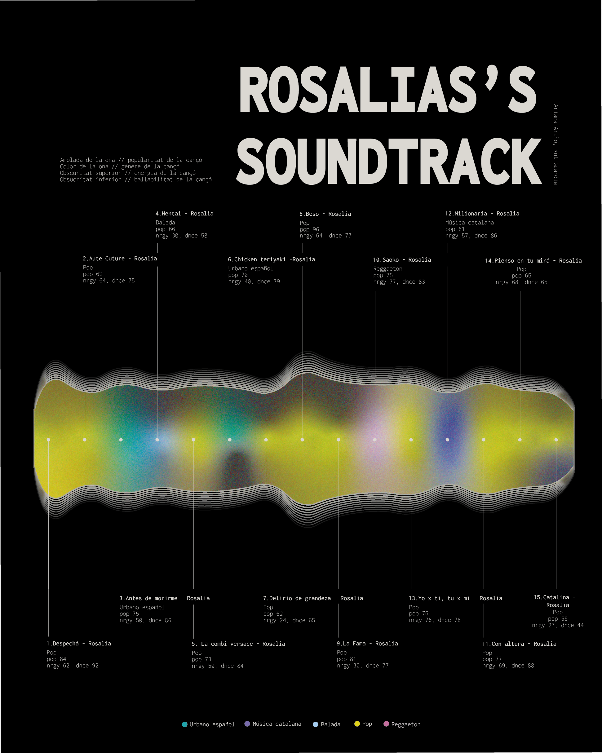
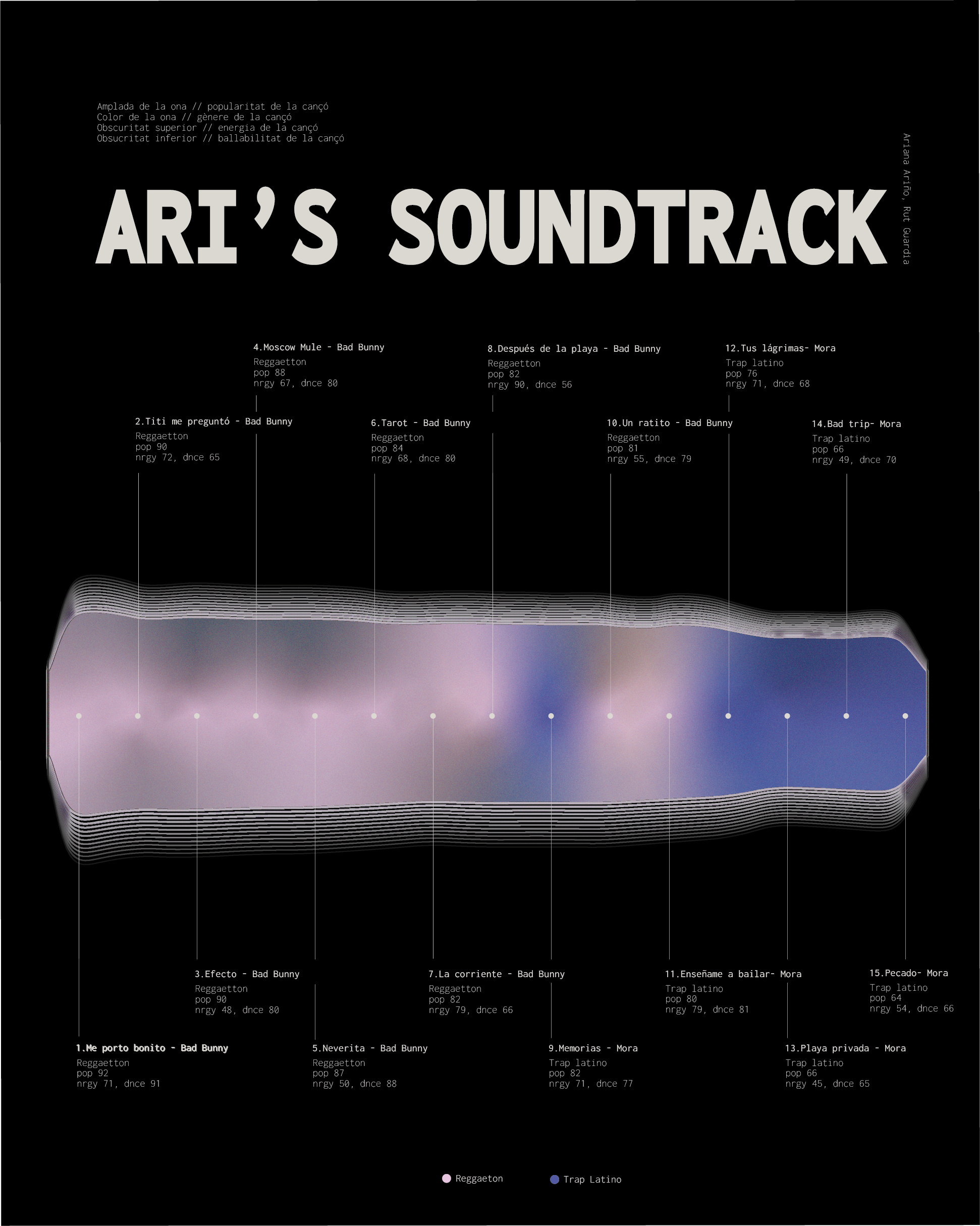
To test its effectiveness, we applied the visualization to other users and artists to see how their music preferences were displayed.
Collaborative work with Ariana Ariño